06.19.2025 Evidentia Group
By Shane Oliver, Head of Investment Strategy and Chief Economist, AMP
Introduction
Successful investing can be really hard in times like the present when share markets are down sharply & very volatile on the back of uncertainty around inflation, rising interest rates and the war in Ukraine. I will be the first to admit that my crystal ball is even hazier than normal in times like the present. As the US economist JK Galbraith once said “there are two types of economists – those that don’t know and those that don’t know they don’t know.” And this is certainly an environment where much is unknown. But the basic principles of investing are simple and timeless and can be particularly useful to bear in mind in times like this.
Chart #1 Time in versus timing
In times of uncertainty its temping to try and time the market, ie to sell ahead of falls & buy in anticipation of gains. But without a proven asset allocation or stock picking process, trying to time the market is very difficult. A good way to demonstrate this is with a comparison of returns if an investor is fully invested in shares versus missing out on the best (or worst) days. The next chart shows that if you were fully invested in Australian shares from January 1995, you would have returned 9.5%pa (including dividends but not allowing for franking credits, tax and fees)
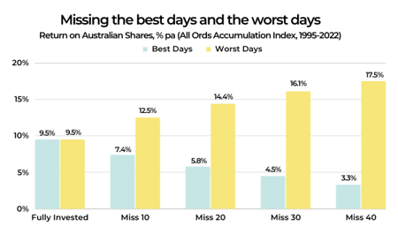
Source: Bloomberg, AMP
If by trying to time the market you avoided the 10 worst days (yellow bars), you would have boosted your return to 12.5% pa. If you avoided the 40 worst days, it would have been boosted to 17.5% pa. But this is very hard to do, and many investors only get out after the bad returns have occurred, just in time to miss some of the best days and so end up damaging their longer term returns. For example, if by trying to time the market you miss the 10 best days (blue bars), the return falls to 7.4% pa. If you miss the 40 best days, it drops to just 3.3% pa. Hence the old cliché that “it’s time in that matters, not timing”.
Key message: market timing is great if you can get it right, but without a process the risk of getting it wrong is very high and, if so, it can destroy your longer-term returns.
Chart #2 Look less
If you look at the daily movements in the share market, they are down almost as much as they are up, with only just over 50% of days seeing positive gains. See the next chart for Australian and US shares. So day by day, it’s pretty much a coin toss as to whether you will get good news or bad news. But if you only look monthly and allow for dividends, the historical experience tells us you will only get bad news around a third of the time. Looking only on a calendar year basis, data back to 1900 indicates the probability of a loss slides to just 20% in Australian shares and 26% for US shares. And if you go all the way out to once a decade, since 1900 positive returns have been seen 100% of the time for Australian shares and 82% for US shares.
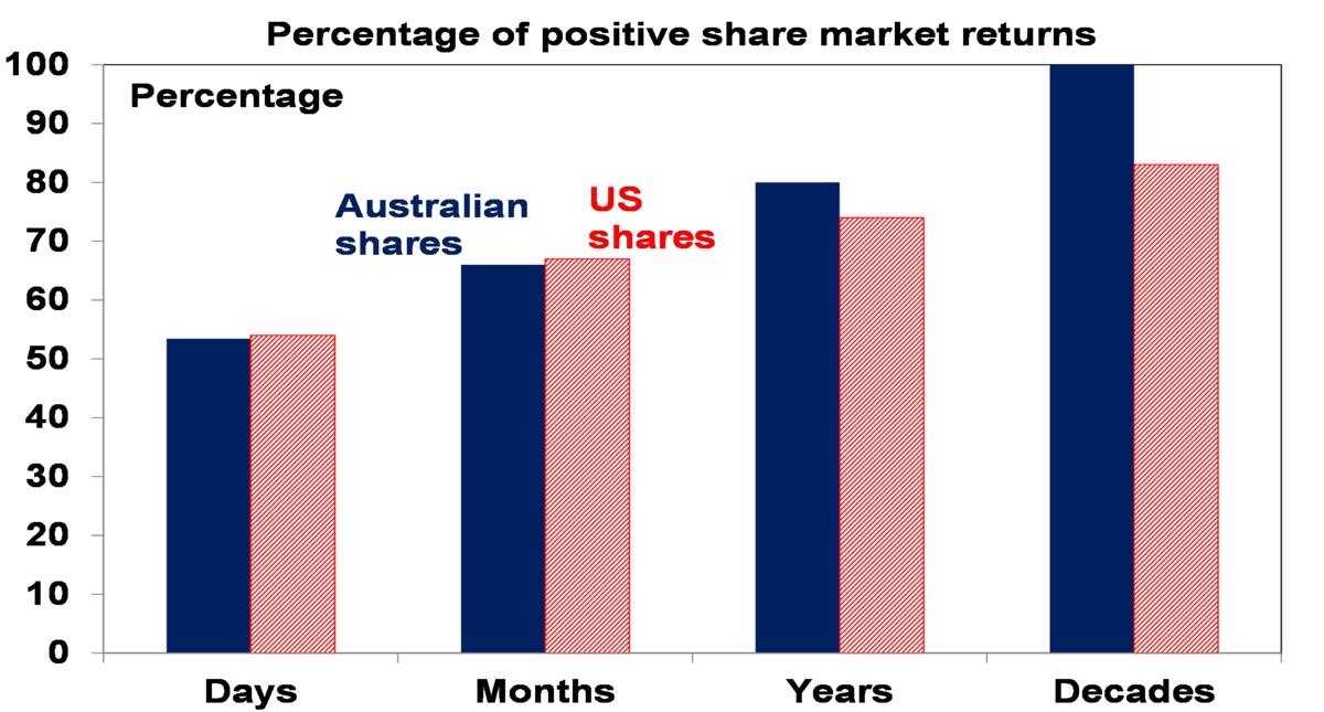 Daily and monthly data from 1995, data for years and decades from 1900. Source: Bloomberg, RBA, ASX, AMP
 Key message: the less you look at your investments, the less you will be disappointed. This matters as the more you are disappointed, the greater the risk of selling at the wrong time.
Chart #3 Risk and return
This chart is basic to investing. Each asset class has its own risk (in terms of volatility and risk of loss) and return characteristics. Put simply: the higher the risk of an asset, the higher the return you will likely achieve over the long term and vice versa. The next chart shows a stylised version of this. Starting with cash, it's well known that its very low risk but so is its return potential. Government bonds usually offer higher returns but their value can move around a bit in the short term (although major developed countries have not defaulted on their bonds). Corporate debt has a higher return potential again but a higher risk of default. Unlisted or directly held commercial property and infrastructure offer a higher return again but they come with higher risk and are less liquid and can be less able to be diversified (except via say a managed fund). Equities can offer another step up in return, but this is because they come with higher risk as they are subject to share market volatility and individual companies can go bankrupt wiping out share holder capital. Beyond this, private equity entails more risk again & so tends to command an even higher return premium. Each step up involves more risk, and this is compensated for with more long-term return. Of course, this neat relationship may not hold in the short-term – eg, government bonds have had worse returns over the last 12 months than shares. And its hard to place “crypto currencies” on the chart – they are very volatile but have not been around long enough to have confidence their long-term returns will compensate for this.
Risk and return across major asset classes
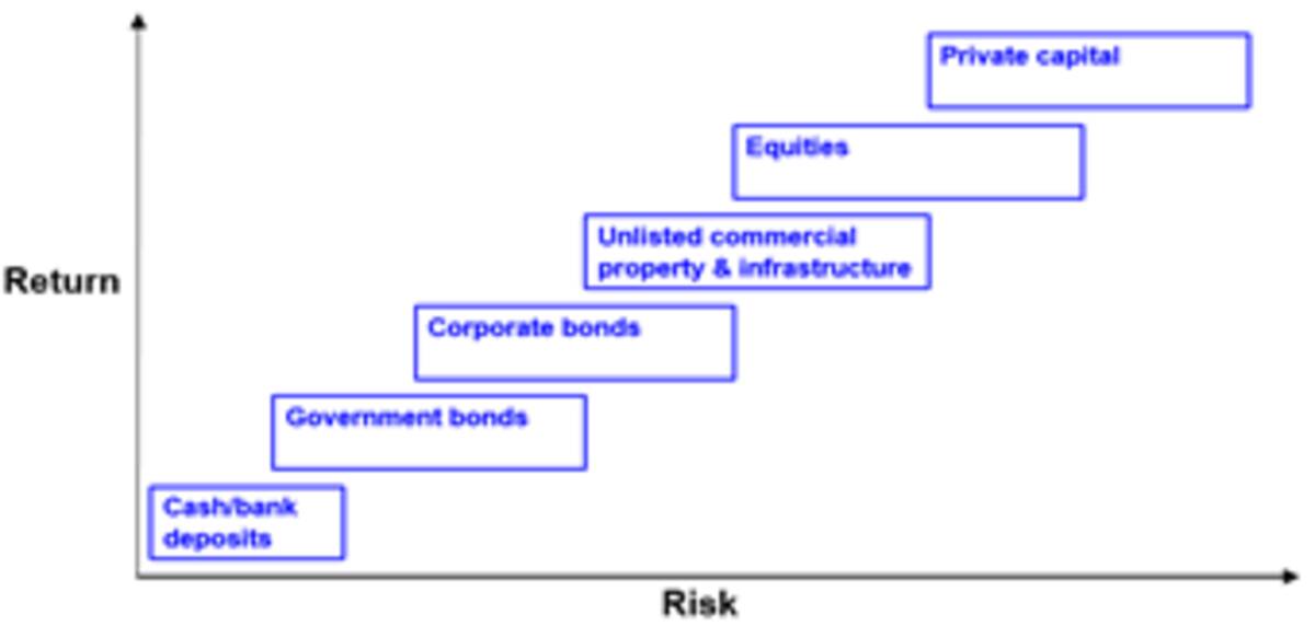
Source: AMP
Key message: Investors need to allow for the risk (and liquidity) and return characteristics of each asset. Those who don't mind short-term risk (and illiquidity in the case of unlisted assets) can take advantage of the higher returns growth assets offer over long periods. The key is that there is no free lunch.
Chart #4 Diversification
But this not the end of the story. The next table shows the best and worst performing asset class in each year over the last 15.
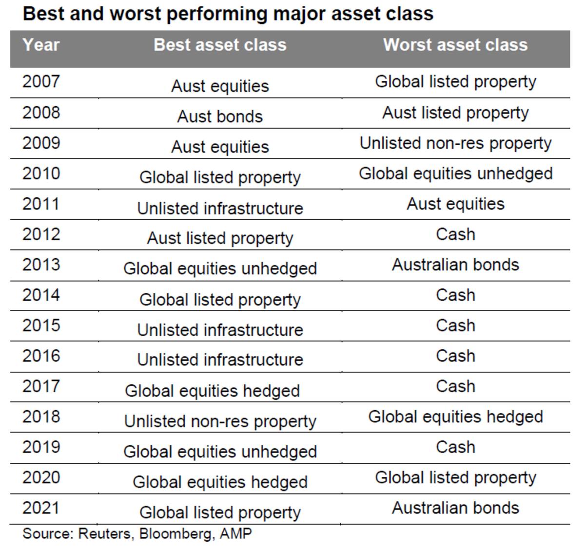
It can be seen that the best performing asset each year can vary dramatically, and that last year’s top performer is no guide to the year ahead. So, it makes sense to have a combination of asset classes in your portfolio. This particularly applies to assets that are lowly correlated, ie that don't just move in lock step with each other. For example, global and Australian shares tend to move together during extreme events. But bonds and shares tend to diverge when crises hit threatening recession – as we saw in the GFC when shares fell but bonds rallied. So there is a case to have bonds in a portfolio to help stabilise returns. Of course, this doesn’t always work, eg like now when inflation is the key danger, highlighting the case for cash & real assets like unlisted commercial property and infrastructure too.
Key message: diversification is also a bit like the magic of compound interest. Having a well-diversified exposure means your portfolio won't be as volatile.
Chart #5 Residential property has a role
Chart #1 in the first edition in this Five Charts series highlighted the power of compound interest, with a comparison showing the value of $1 invested in various Australian asset classes back in 1900 and what it would be worth today. Unfortunately, I do not have monthly data for Australian residential property returns back that far but I do have them on an annual basis back to 1926 and this is shown in the next chart starting with a $100 investment.
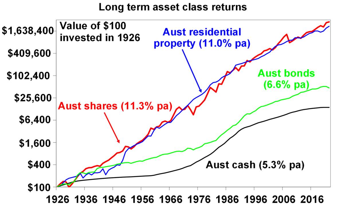
Source: ABS, REIA, RBA, ASX, AMP
Again it can be seen that over very long periods the power of compounding works wonders for shares compared to bonds and cash. But it can also be seen to work well for Australian residential property with an average total return (capital growth plus net rental income) of 11% pa, which is similar to that for shares. All of which highlights, along with the diversification benefits of a real asset like property, the case to have it in a well-diversified portfolio along with listed assets like shares, bonds and cash. The key is to allow for the different "risks" experienced by property versus shares. Property prices are less volatile than share prices as they are not traded on share markets and so are not as subject to the whims of investors and movements in their values tend to relate more to movements in the real economy. But residential property takes longer to buy and sell and it’s harder to diversify as you can’t easily have exposure to hundreds or thousands of properties exposed to different sectors and countries like you can with shares. So, there are trade-offs between residential property and shares.
Key message: given their long-term returns and diversification benefits, there is a key role for residential property in your investment portfolio - putting aside the current threat to the housing market from poor affordability and rising interest rates.
This article was written and is accurate as of 10 May 2022.